


Skip to content

使用文档
个性化主题
基于OpenTiny的视觉设计理念,TinyPro of Vue站点已添加了六套常用的主题(默认主题、糖蜜主题、紫罗兰主题、深邃夜空主题、深色主题、自定义主题)供大家参考,其中默认主题为华为云默认主题风格。
在线主题设置
在TinyPro of Vue站点,我们已集成主题切换功能,你可以切换当前站点为我们已内置好的主题风格,并实时预览。
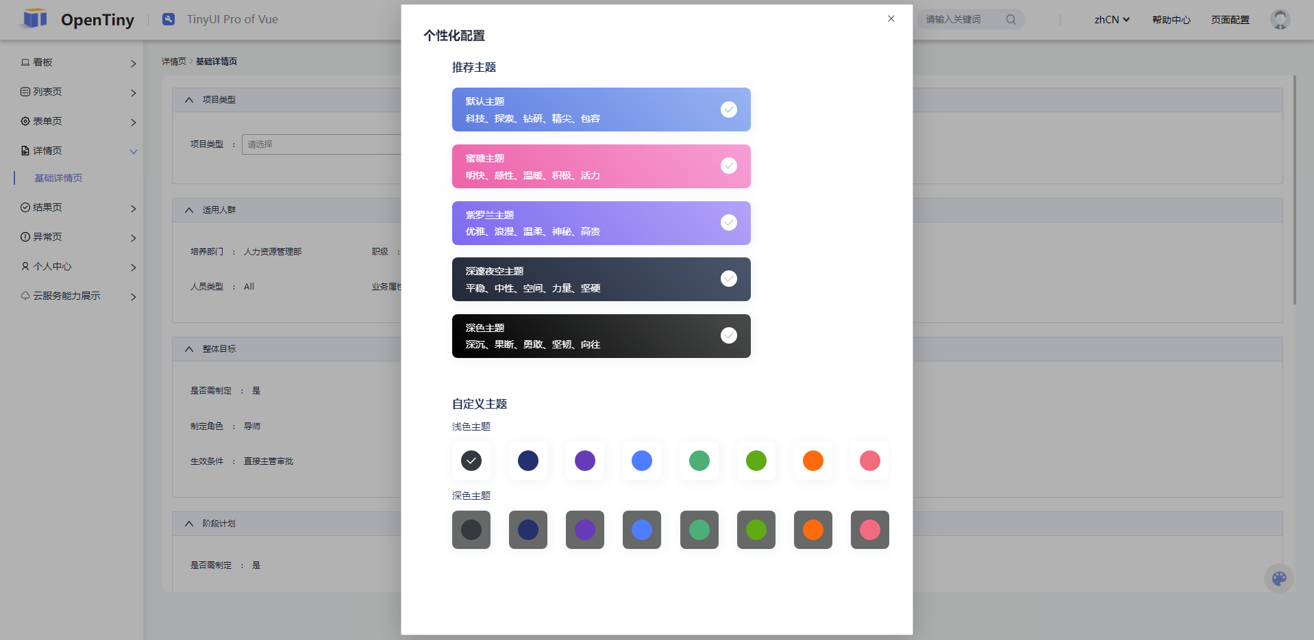
src/components/theme组件中,实现主题切换功能
html
    <div class="theme-choose">
      <div>
        <span>Light</span>
        <span>Dark</span>
      </div>
      <div>
        <div v-for="(index, item) in SwitchColor" :key="index">
          <div
            class="theme-block"
            :style="{ 'background-color': item.color }"
            @click="choose(item)"
          >
            <iconYes v-if="item.value === index" class="theme-yes"></iconYes>
          </div>
        </div>
      </div>
typescript
  const choose = (item: {
    value?: number;
    color?: string;
    dark: any;
    theme: any;
  }) => {
    index.value = item.value;
    theme.changeTheme(item.theme);
    dark.value = item.dark as string;
  };
自定义扩展主题
增加自定义主题类型和自定义主题相关配置,参考src/components/theme/type里面的配置
typescript
const Theme13 = {
  id: 'tiny-theme-13',
  name: 'Theme13',
  data: {
    'ti-base-color-brand-1': '#f36b7f;',
    'ti-base-color-brand-2': '#f36b7f;',
    'ti-base-color-brand-3': '#f36b7f;',
    'ti-base-color-brand-4': '#f36b7f;',
    'ti-base-color-brand-5': '#f36b7f;',
    'ti-base-color-brand-6': '#f36b7f;',
    'ti-base-color-brand-7': '#f36b7f;',
    'ti-base-color-brand-8': '#f36b7f;',
  },
};